The Dymaxion Map - a conceptual tool for confronting historical cartographic distortions
An Interview with Kurt Przybilla on the history and significance of the Dymaxion Map
The SOUTH SOUTH platform aims to become a resource, an aggregator and a knowledge-sharing space for people interested in art and arts practitioners related to the Global South. This includes confronting historical cartographic distortions that assist in mapping out and translating the world in a way that eclipses alternative and diverse global art centres. Through contemplating this the Dymaxion Map became an important visual element in thinking about how to shift imaginaries regarding the interconnection of regions and assumptions about geographical hierarchies. This map has also inspired designers, geographers, artists and other practitioners in their creative process and practice. This can be seen is works such as Desmond Lazaro’s Dymaxion Map III Vasco de Gama, Christopher Colombus, Fernao de Magalhaes and James Cook (2018).
The Dymaxion Map was created by designer, architect and systems theorist Buckminster Fuller in the mid 20th century. We reached out to the Buckminster Fuller Institute (BFI) in San Francisco and had a conversation with Kurt Przybilla, a long time BFI member and advisor. Together we nerded out over the history of the map and its significance for thinking about the relationship between perceptions of the Earth’s geography and its sociopolitical consequences.
SOUTH SOUTH (SS): Could you please share more about the history of the BFI, its significance and your role within it?
Kurt Przybilla (KP): The Buckminster Fuller Institute was started after he passed away by his daughter and grandson who first of all housed his archive. He was often described as the Leonardo of the 20th century. He has the largest personal archive that was known prior to the internet. That archive was there when he passed away. He started saving everything he ever wrote on from 1917. It was over 40 tons of material which was acquired by Stanford University. Fuller did a large amount of work during his lifetime and the Dymaxion Map was created within the context of his other work and ideas.
The BFI was set up to house and organise the archive. Once the archive was acquired by Stanford, the mission of the BFI shifted more towards continuing the work Fuller began. I am a long time member and advisor to the BFI. I became fascinated with his ideas after reading a book and eventually created a new type of spinning tip that was based on the models I was making while studying his work. He is best known for his invention of the geodesic dome, most recognisable in children’s playgrounds in the form of a jungle gym. He invented that structure architecturally and popularised its use on the planet. He had around 28 patents in his lifetime, one of which he got for the Dymaxion Map; he got a patent in cartography for that projection.
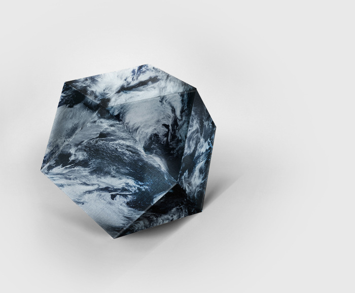
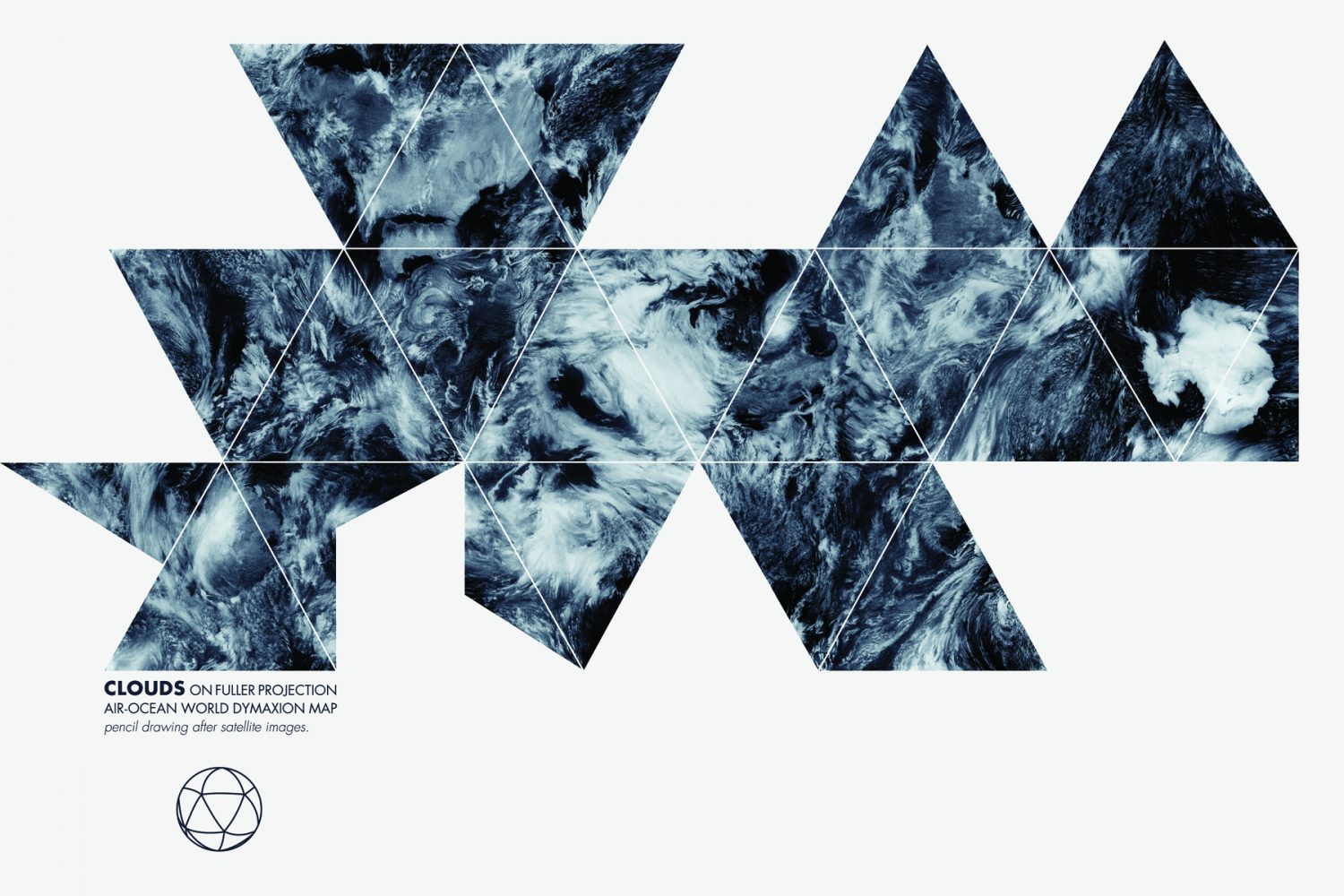
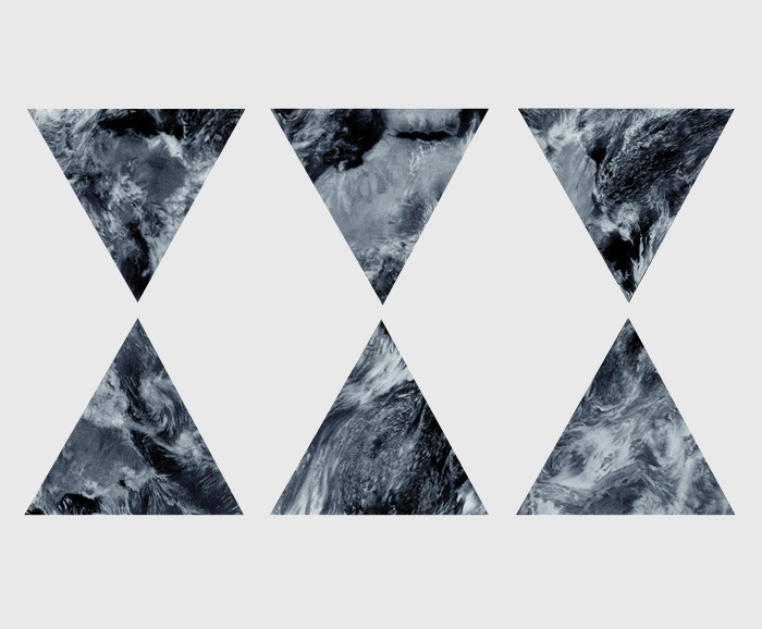
Clouds Dymaxion Map by Anne-Gaelle Amiot
Fuller would point out very often that there are no borders on the planet. They are all man made.
He did the Dymaxion house first and then the Dymaxion car. He was trying to invent things that would help all of humanity become a success which was his major mission. That idea was at the heart of his intentions for the inventing and trying to come up with things. The Dymaxion Map grew out of that idea. Fuller spent the later part of his life travelling around giving talks which he never prepared; he referred to these as his ‘thinking out loud’ sessions.
He started to visualise the planet, early on he self published a book in 1927 called 4D Time Lock that contained an illustration of the globe and he called it a ‘one town world’. He was showing how aviation was going to change the planet. It all became a one town world when one could go anywhere on the planet within a day. Within his archive he began to chart what he called the chrono files; he was charting his own progress but also humanities progress through invention. He noted an accelerating acceleration of technology particularly in the 20th century that was changing humans’ relationship to space and time. He became fascinated with the aviation industry and with Einstein’s work, that is where the 4D came in. He was also delving into geometry at the same time.
This idea of ‘one town world’, he wrote a book in 1938 called Nine Chains to the Moon, and the first page of the book shows the idea of the one island world that translates into the Dymaxion Map later. It shows the land map of the planet in a flat map but undistorted, unlike the planet’s representation in other flat maps, the most common being the Mercator projection. The Mercator projection is a cylindrical projection, so you take a sphere like the earth and take a piece of paper and wrap it around in a cylinder. Where it touches the earth is the equator and that is the only place where it is accurate proportionally. As you move further away from the equator you get distortions so that land mass and other elements near the poles become incredibly large. There is always a distortion guide at the bottom of the Mercator projection maps. In this projection, Greenland appears to be larger than South America and almost the same size as Africa. Some Mercator projections show an edge of Antarctica and others show a large portion of Antarctica. Antarctica is larger in Australia and one cannot see this in a Mercator projection. Everything you look at is distorted. There are very few projections that have the accurate proportions for land mass or the oceans. Fuller, in this Nine Chains to the Moon shows the earth laid out. He did not come up with the geometry on how to fold that flat.
Archimedes came up with a 14 sided shape that Fuller became fascinated with, and originally mapped the Earth using that 14-sided shape. In 1948 when he was at Black Mountain College. Dymaxion Map first published in Life Magazine in 1943 during WW2 and it had a cut out cardboard Dymaxion Map that could be assembled together and have this model. That 14-sided shape was not the optimal and his design strategy was to do more with less. In 1948 he came up with the first geodesic dome which is based on the icosahedron; the closest one can get to a sphere with 20 equilateral triangles. He figured out that the Dymaxion Map would be better on an icosahedron to allow for the least distortion.
In 1953-4 Fuller came up with the Dymaxion Map as we know it today which is mapped on an icosahedron. The first map he did based on the icosahedron included colours based upon temperature so that one could see the temperate zones and where most of the population on the planet is and one can view the uninhabitable zones due to temperature. This is known as the Dymaxion Air Ocean World Map.
SS: We are interested in pushing past the idea of the global north as the centre for arts, discourse and knowledge production. The map speaks to the idea of shifting perspective. This connects to the real and symbolic representation of the map as an outline of the world that highlights the relationships among all nations and cultures of the world rather than one which emphasizes artificial boundaries between them. Could you share more about Fuller’s non-hierarchical approach to geography?
KP: Fuller would point out very often that there are no borders on the planet. They are all man made. The layout that he had he would refer to as a ‘one island, one ocean world’. It is all connected and there is no hierarchy. The other term that he came up with is ‘spaceship earth’.
The map itself is a symbol of this interconnectedness; that there is no North or South unless it is relative to somewhere. The advance in technology is changing our relationship to space and so these delineations of North and South are all relative. And if one looks at how the Dymaxion Map is usually shown what is considered North and South is usually in reverse, which changes the way that people look at the world geographically. It is more of a convention of thinking than the way anything is. The North and South that we do have is a magnetic North as a planet that is spinning through space and keeps its orientation. It is gyroscopic due to how it’s flying. He would always get people to think as large as they can; you have to start with the universe when considering anything and then think in whole systems. We need to think of our planet as a single whole system operating within the universe. He would point out that our spaceship earth is very fragile and so it has to be all of us or none of us. And the design science revolution; changing the planet through design by shifting from weaponry to ‘livingry’.
Right now the BFI have a design science lab going with artists and creators from across the globe working via Zoom together as a studio. It is part of the design science decade to have this studio going on for the next 10 years.
SS: Could you please share more about the significance of the Dymaxion Air-Ocean World map, particularly in relation to ideas around visual distortion and how maps influence our imaginaries of the world?
KP: This map has no boundaries and no real directions, such as the concept of North-South. In the publication of the first Dymaxion Map in Life Magazine they showed multiple different arrangements. It was possible to arrange the pieces to create different layouts.
There is no up and down, there is only towards and away, or has Fuller would say, in and out. That whole reorientation of thinking of the earth as a spaceship flying through and we are all part of this one town world.
Clouds Dymaxion Map by Anne-Gaelle Amiot
Fuller thought of the map as a conceptual tool that would allow people to think about things differently.
SS: I am also quite interested in the idea of the Dymaxion Map as a tool, and as the BFI frames it, a tool for global responsibility in relation to the environment and understanding that actions on one side of the world have an impact on the other side of the world. Could you expand on this? Perhaps you could share more on the studio you mentioned and if they are thinking about the map in that way?
KP: Fuller thought of the map as a conceptual tool that would allow people to think about things differently. Seeing the planet as it really is, or more proportionate, you do not get that distorted view. We are often misinformed by our education system because if you think about it most of the maps we see are Mercator projections created with 1500s technology. It was a convenient map for sailors. The Dymaxion Map is meant to help you think about things differently but also see things differently to be able to imagine connection. This is a way of reorienting your thinking to think about the planet as whole.
–
The images accompanying this interview come from BFI’s DYMAX REDUX (2013), an open call competition that recognised the idea of the map as a tool and invited the creation of new and inspiring interpretations of the Dymaxion Map.
Credits
Buckminster Fuller Institute
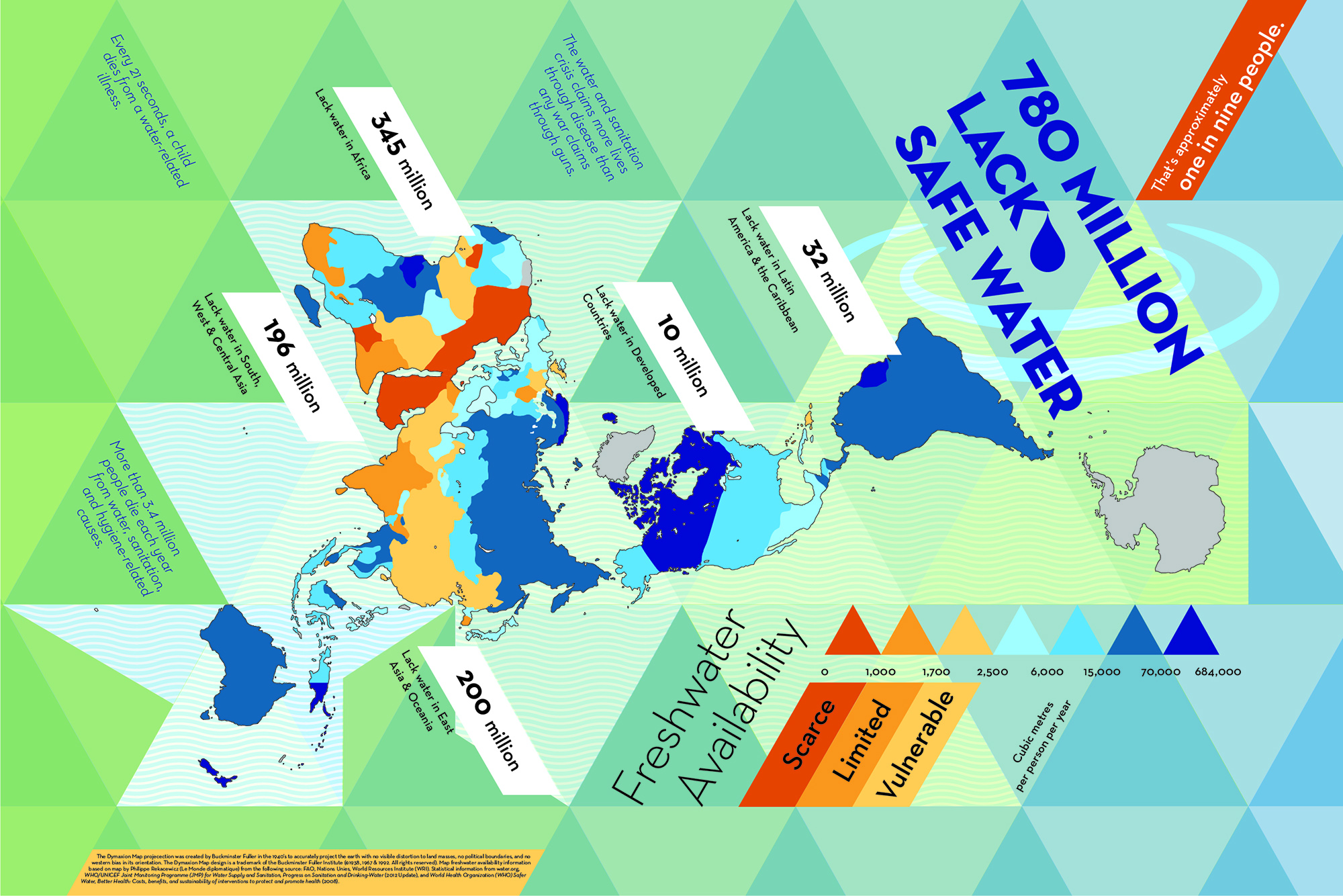
In Deep Water by Amanda Rachel Johnson
Clouds Dymaxion Map by Anne-Gaelle Amiot
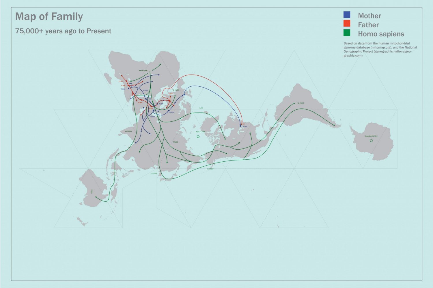
Map of My Family by Geoff Christou